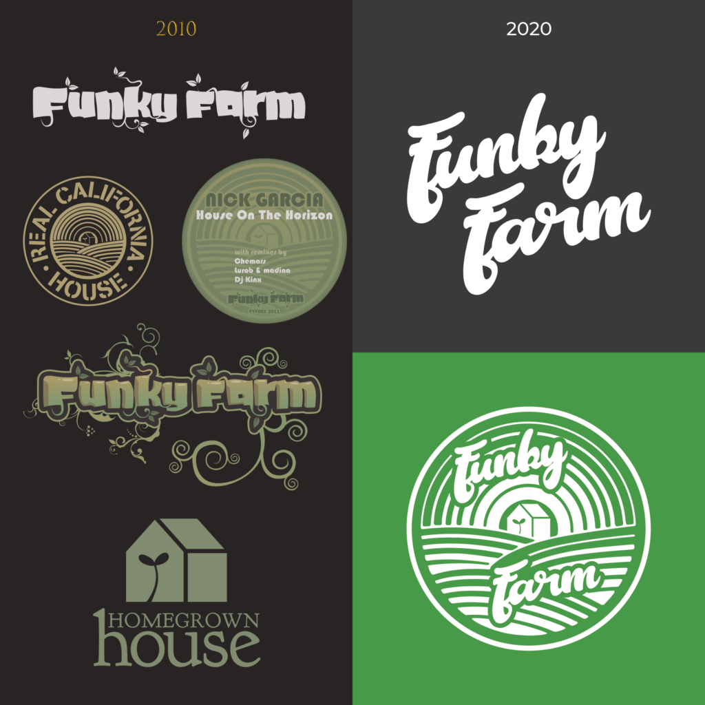
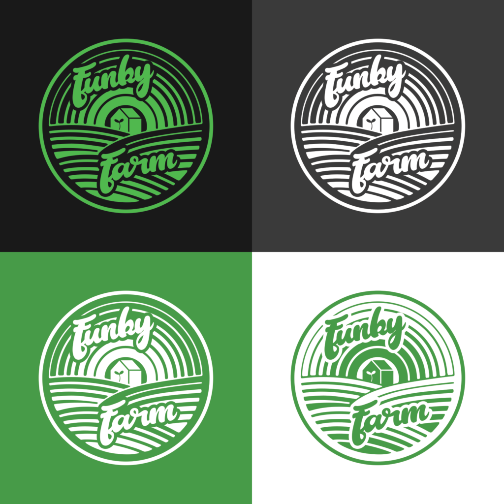
In the 10th year of our existence, we’ve decided to roll out a rebrand. Keeping some elements of the original branding, like the background parodied from the “Real California Cheese” logo. Which, in an ironic way, also looks like sound waves. It was used in our “Real California House” shirts as well as the cover art for our first release FYF001 House On The Horizon E.P. And with the addition of the “sprout house” in the center which is a play on our tag line “Where House Grows!”. Taken from our previous label Homegrown House which we had three releases on before we changed the name to Funky Farm.
You can think of it as symbolizing the creation of house music. Both in terms of its inception (R.I.P. Frankie Knuckles), as well as the creation of the amazing new house tracks every day from our talented artists as well as all of the talent in the house music community worldwide. The scene is alive and well!
We went with a baseball-like script font for some urban vibes. Underground House music has always gone hand-in-hand with the urban culture of major metropolitan cities.
We are proudly Bay Area-based as the San Francisco bay area has long been a hot spot for House Music. And there’s no mistaking that it’s also a sports town as well.
We’re back in action in 2020 and are poised to revamp the label. We’re super excited about what’s to come as more artists have been added to the roster and many more releases are on deck!
Stay tuned as we also plan on releasing some apparel, accessories, and swag to go along with our new logo.
